Ayurveda School Mobile App
App for Ayurveda students to be able to set up profiles and goals, track their progress, and share it with their instructors.
2-week design sprint
Roles
UX Research
Prototyping
UI Design
Tools
Otter.io
Miro
Adobe XD
Adobe Illustrator
UseBerry
Challenge
This case study is part of Ironhack's UI/UX Bootcamp Wellness project. Yet, for this design sprint, I was allowed to go outside of the project scope and work with a real company: Boston Ayurveda School (BAS).
"Boston Ayurveda School is one of the seven schools of Down Under School of Yoga, New England’s premier yoga school, home to some of America’s finest yoga teachers, Ayurvedic practitioners, bodyworkers and a vibrant student body." —DUY Website
Boston Ayurveda School students were often getting lost in their education process, while not being able to find a clear syllabus, calendar, or course outline in their portal. They were also confused with the school using many different communication channels and having a lengthy onboarding process.
01 - PROBLEM
The company struggled with communication problems. There was noise between student and staff, students and practitioners, and within the company staff as well. They used mainly e-mail and phone only (as for now they started using Slack and seem to be slowly adapting to it) and students had to switch between learning portal, school website, phone and email to get their jobs done;
02 - BRIEF
Ayurveda School app facilitates the onboarding, navigation, and communication between different users - students, staff, practitioners, and administration. As well as satisfies the pre-requisites of Ironhack (setting up goals, tracking their progress, and sharing it with their instructor).
The app was designed around new and old students attending courses on Ayurveda School. It helps users with little to no experience with technology navigate through their courses, without having switch between 4 platforms to do so.
03 - TARGET
04 - SOLUTION OVERVIEW
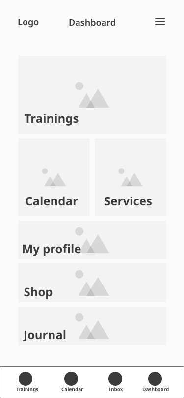
Features
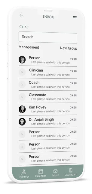
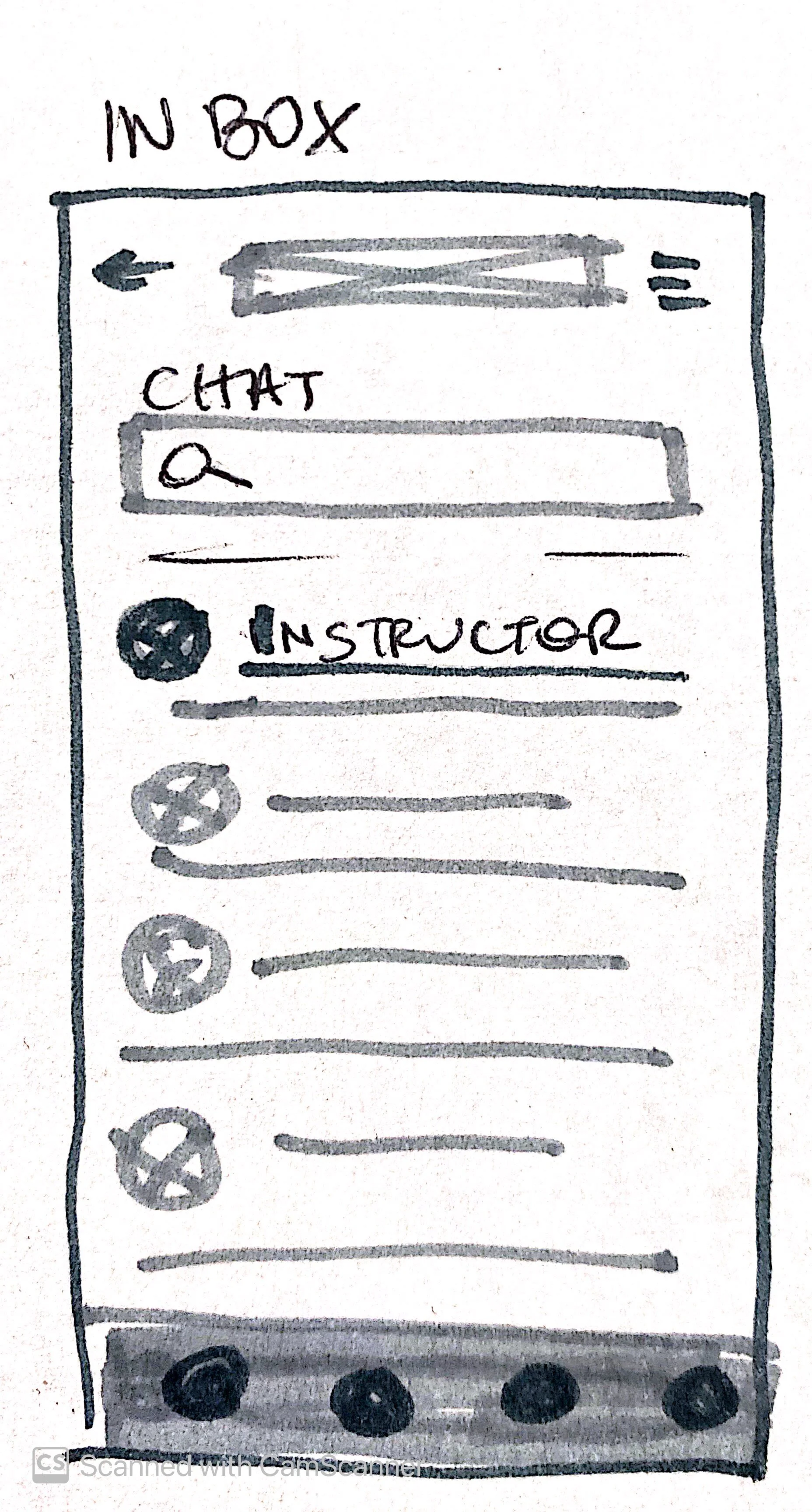
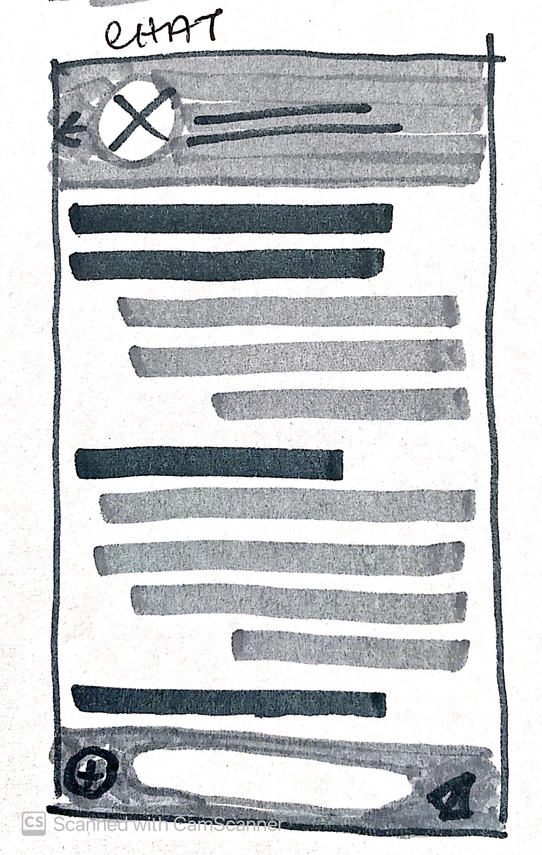
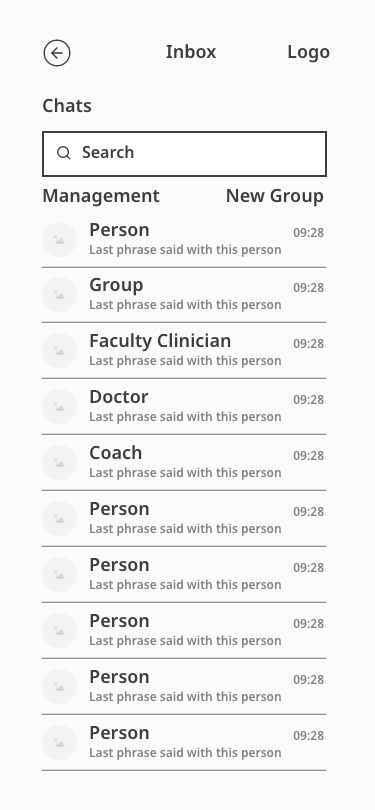
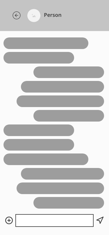
Inbox & Chat
Based on research and the persona, I tried to keep a simple UI to make sure users with low affinity with technology could navigate through the tool seamlessly.
I wanted to make it easy for the student to communicate with faculty, other students, and doctors in one place.
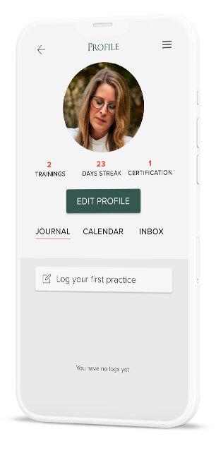
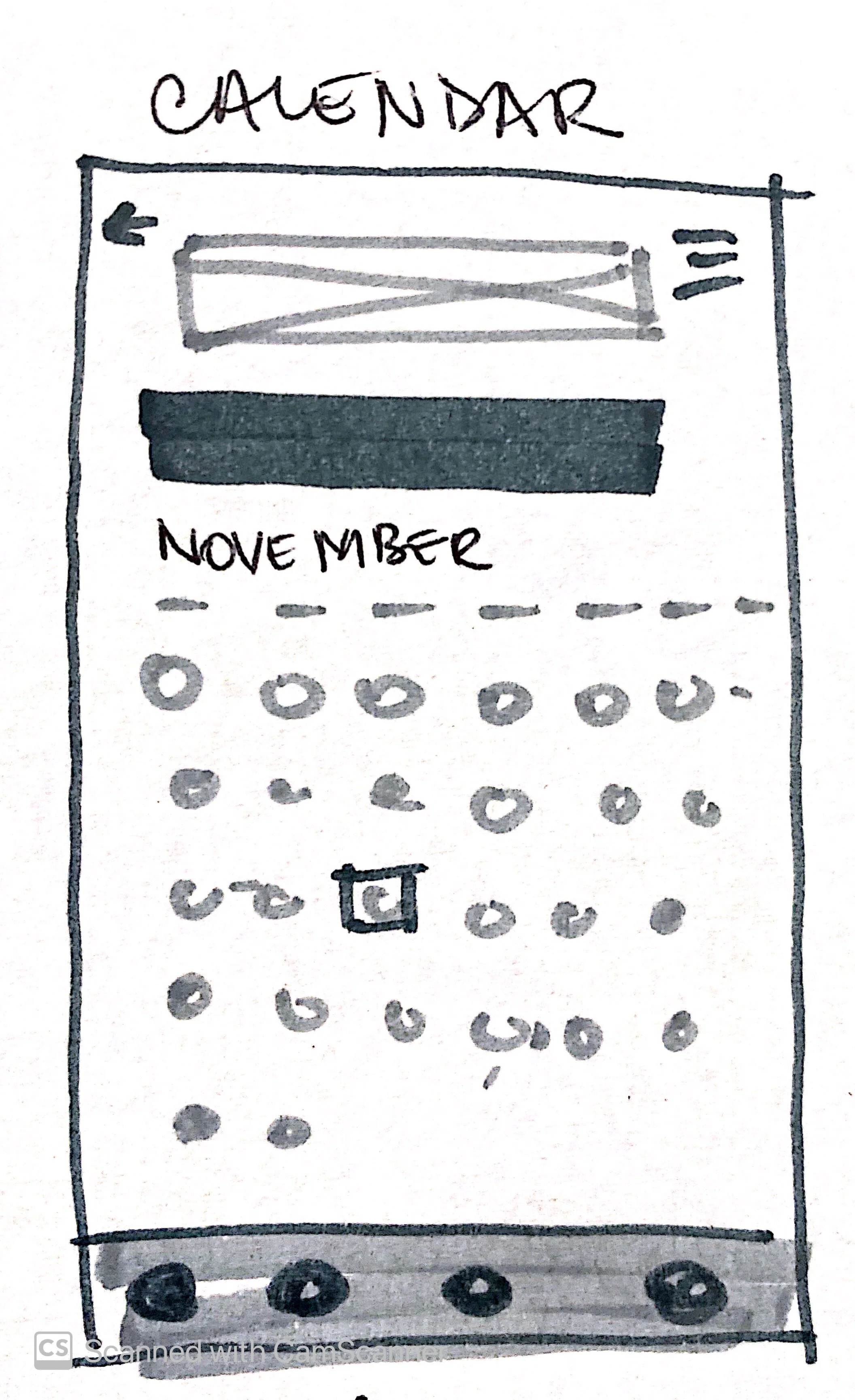
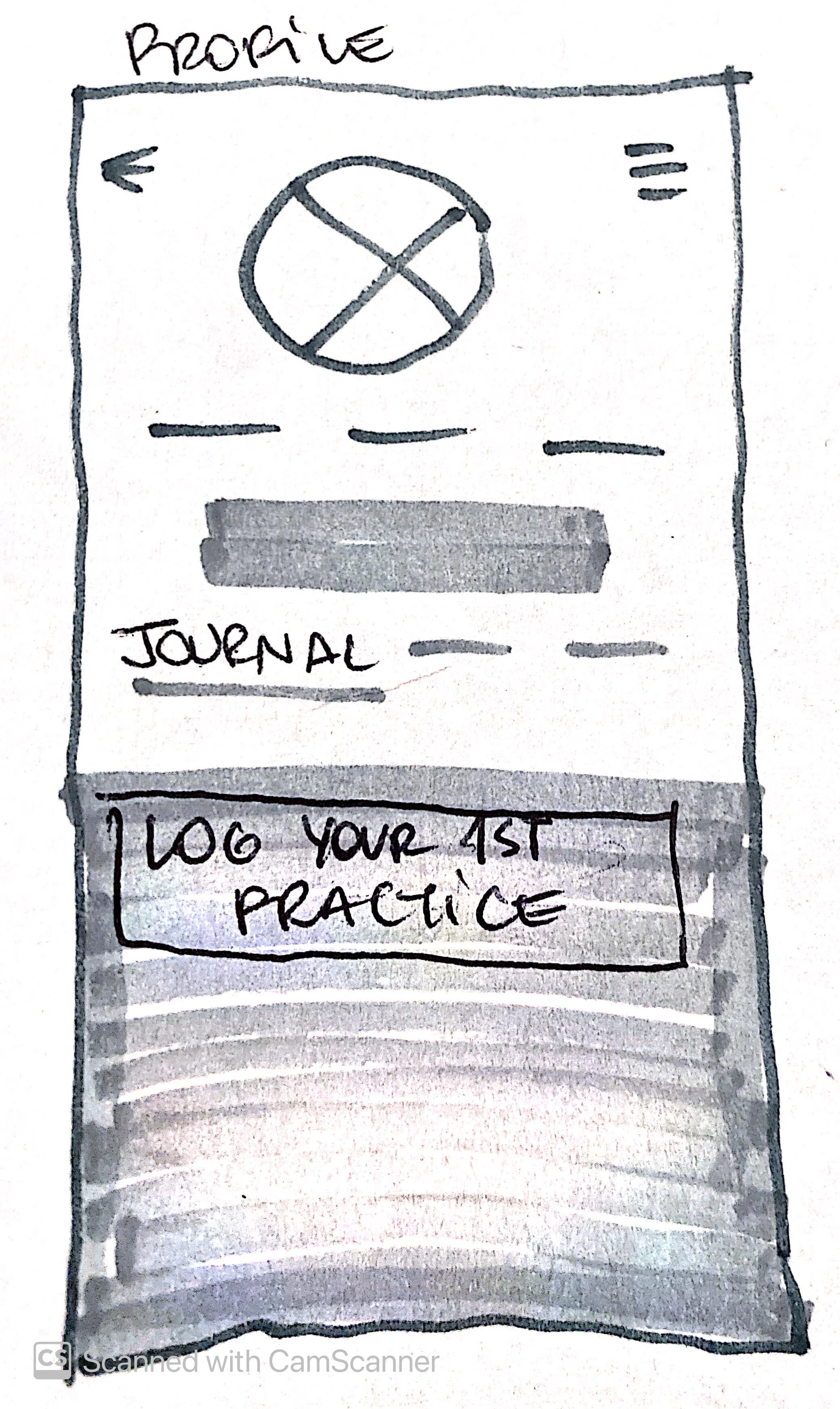
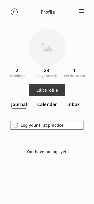
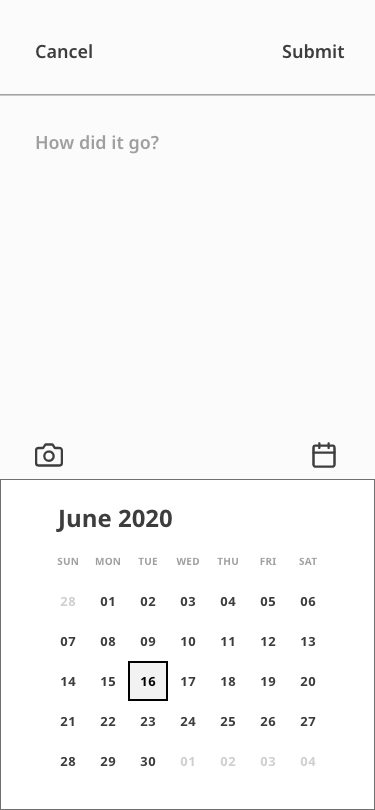
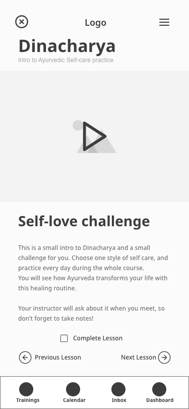
Practice Journal
The journal worked as the progress tracker. In Ayurveda, there is a morning self-care routine with different steps - Rise before (or with) the sun, meditate, clean your tong, etc.
Students were already required to choose from those steps, track their Ayurvedic practices at home, and share it with their instructors, but they lacked the support for note-taking. This also fulfilled the Ironhack requirement of student progress tracking.
" If I had a magic wand and could change anything about the course, I would add a manual or a slide deck to take notes."
- Student survey response
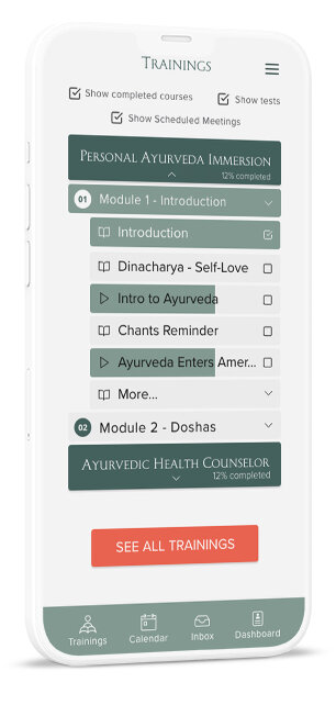
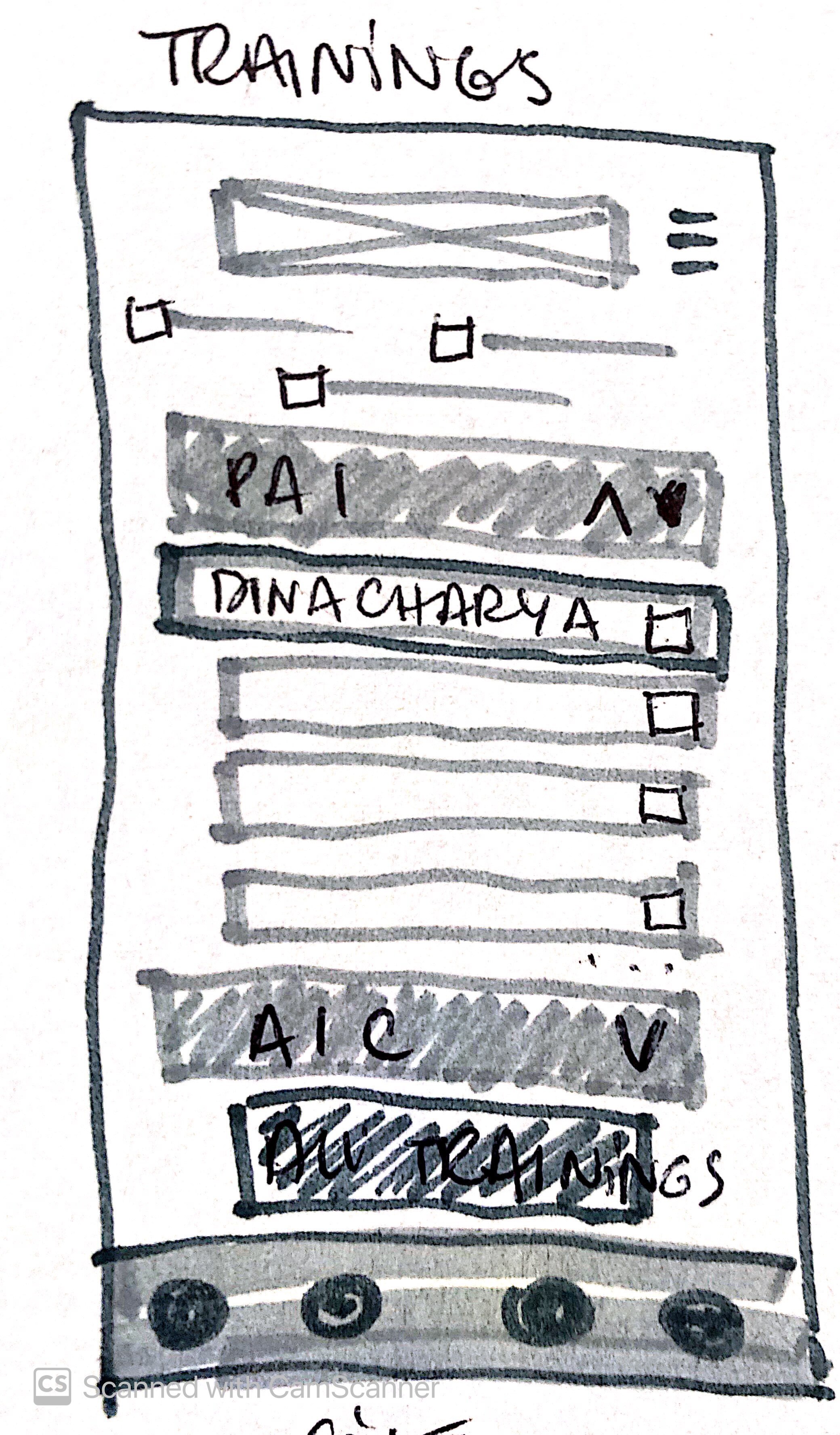
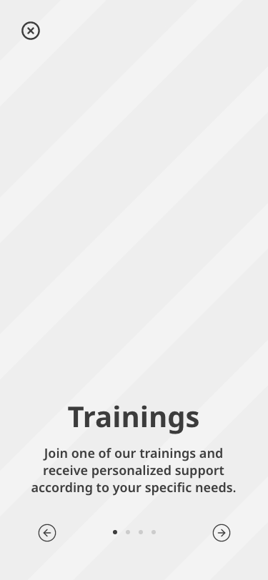
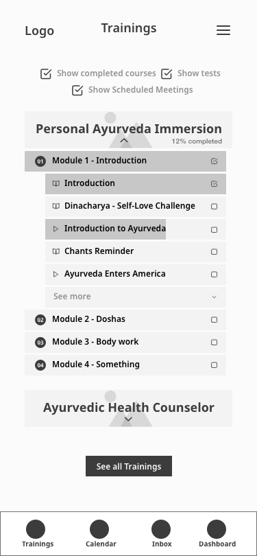
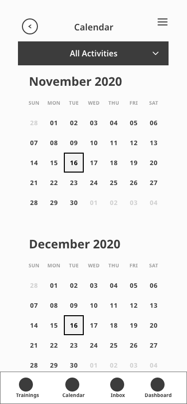
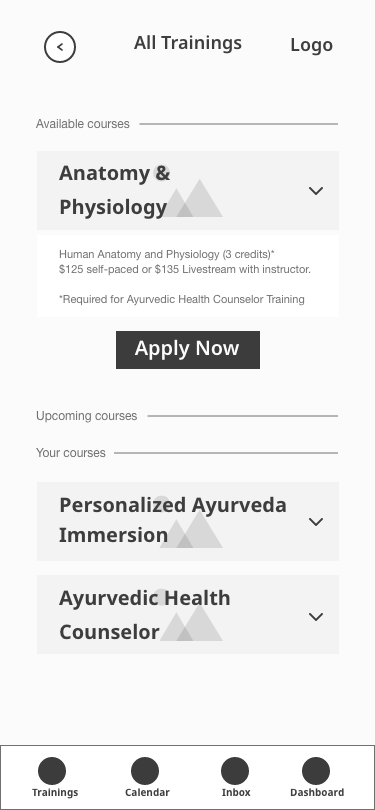
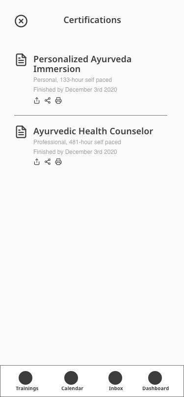
Training & Syllabus
As a result of surveys - 33% of students complained about not having a clear syllabus - I introduced a button that would give them access to it before applying to any course.
I also organized all training on one page, with current and past courses. Students are now able to revisit any class and rewatch each course's content anytime.
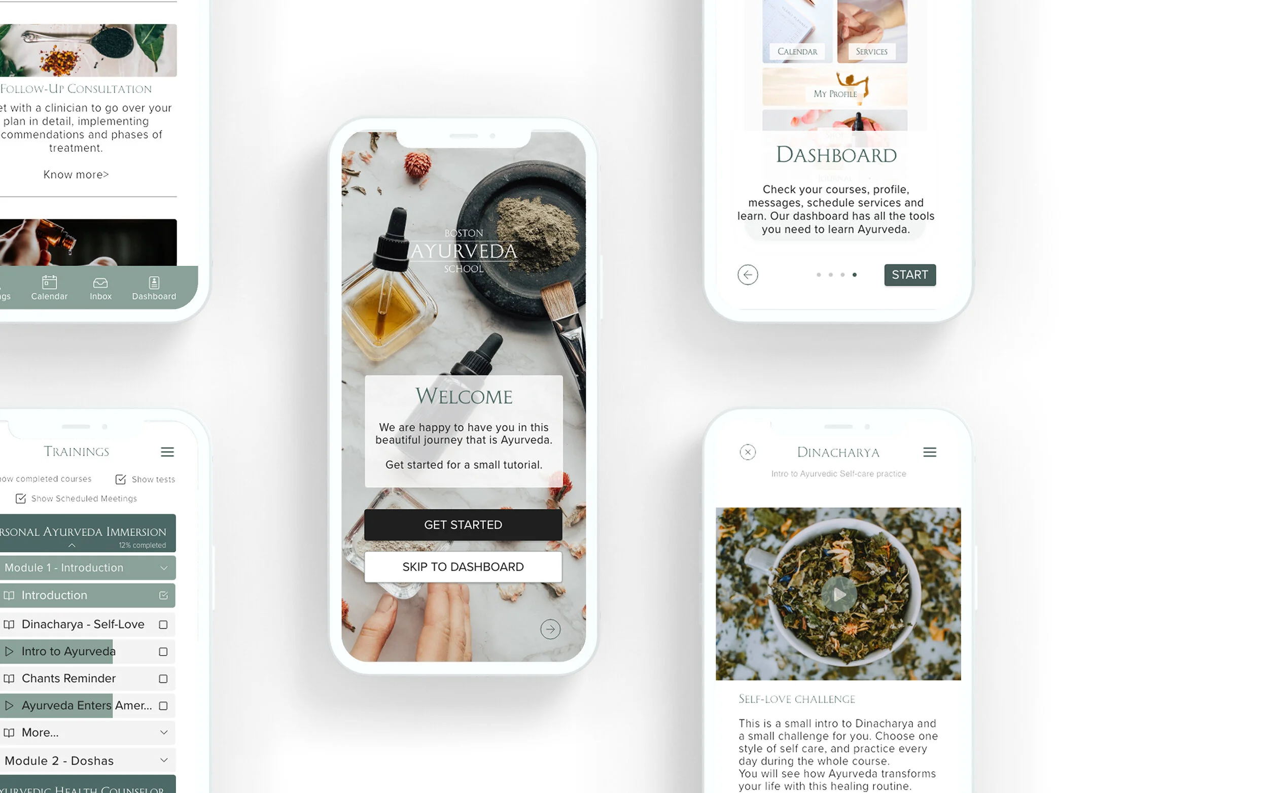
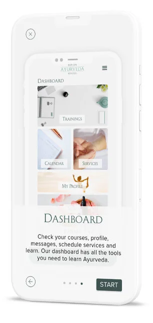
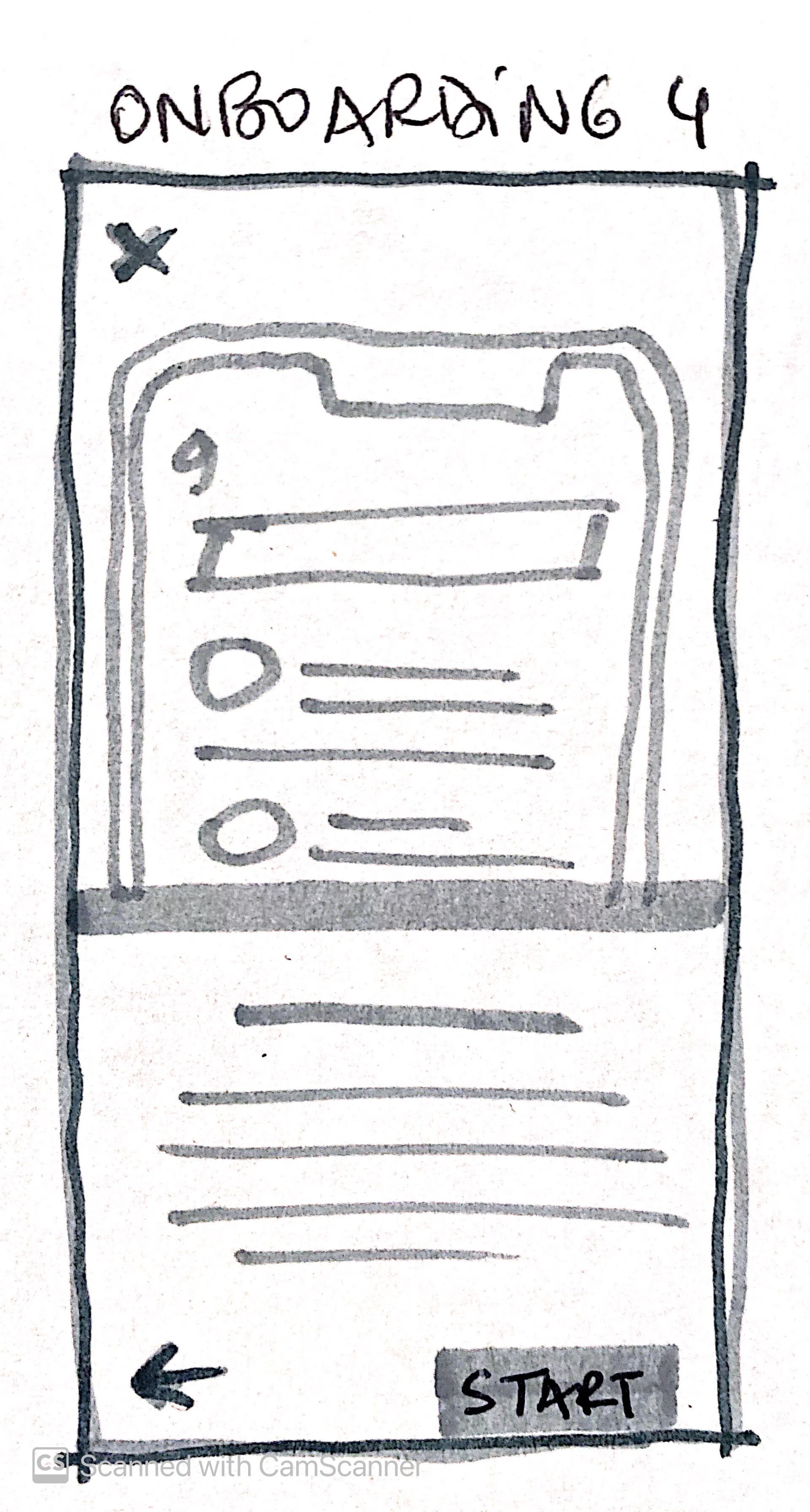
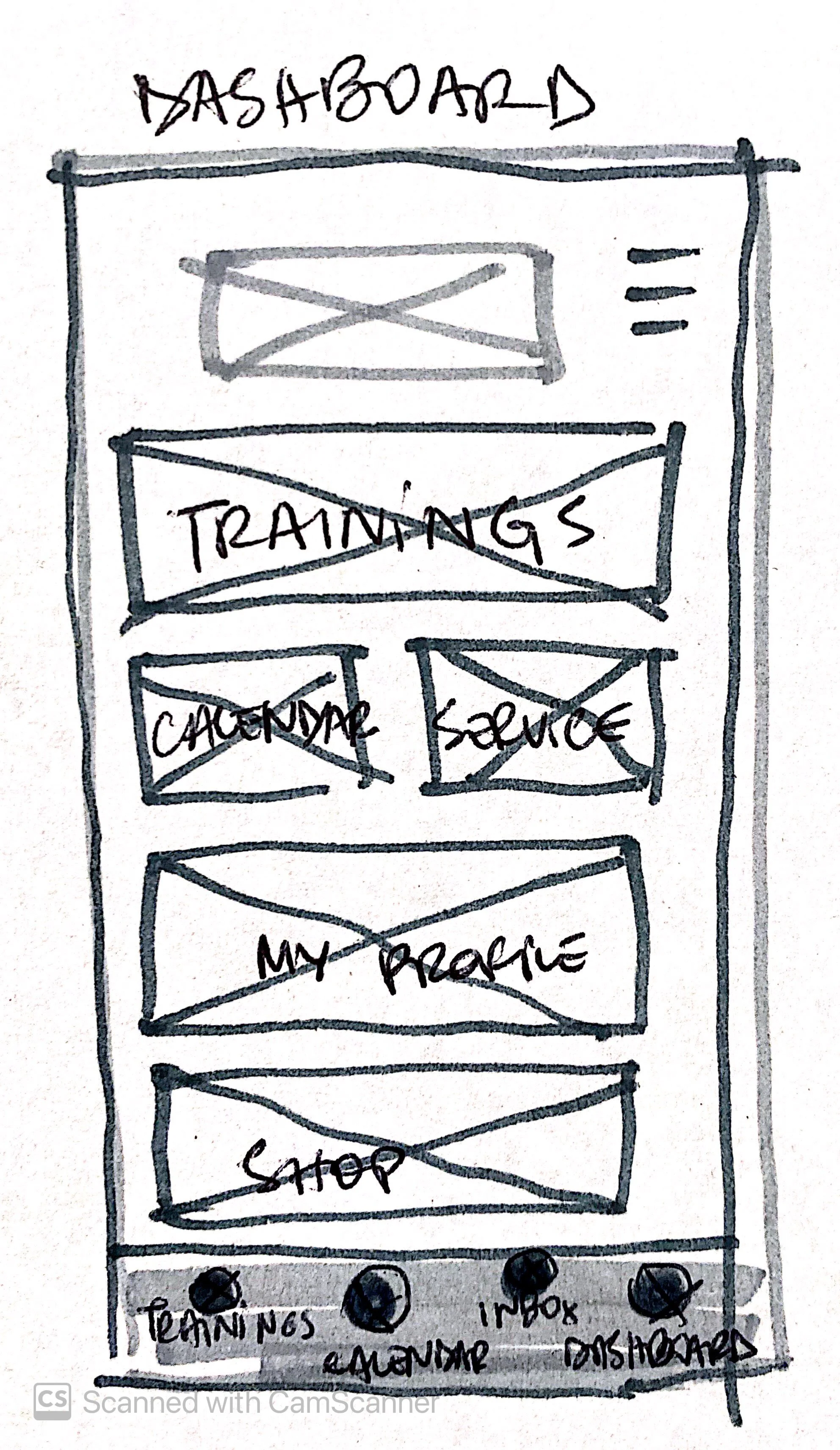
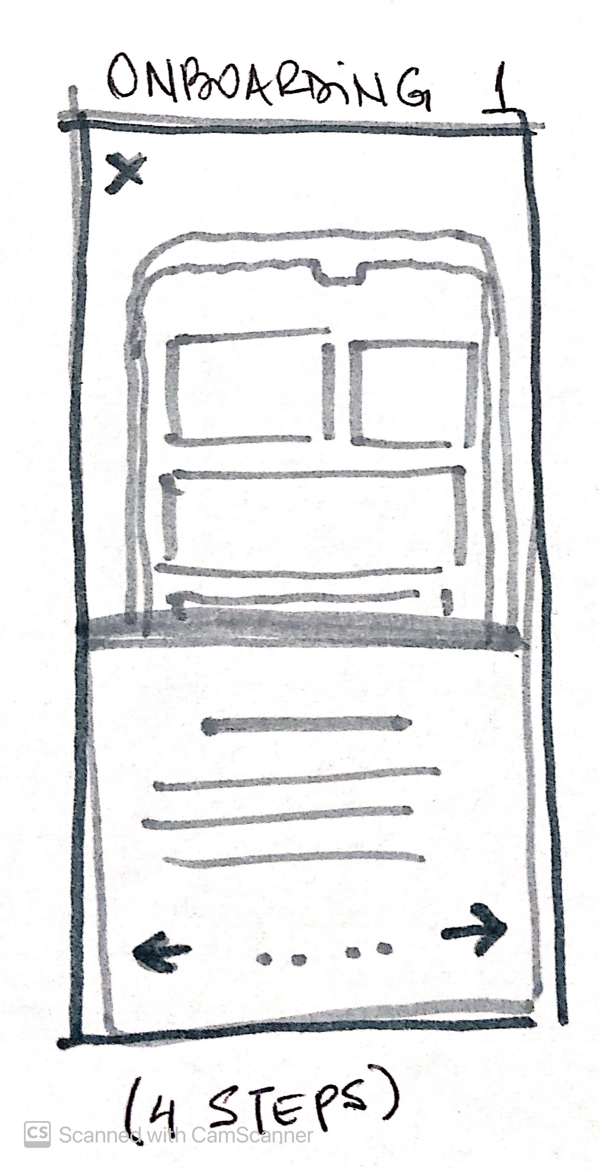
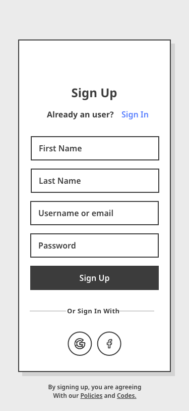
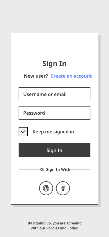
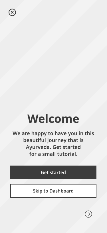
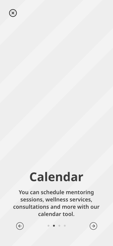
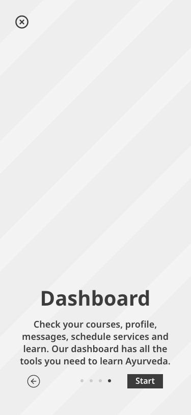
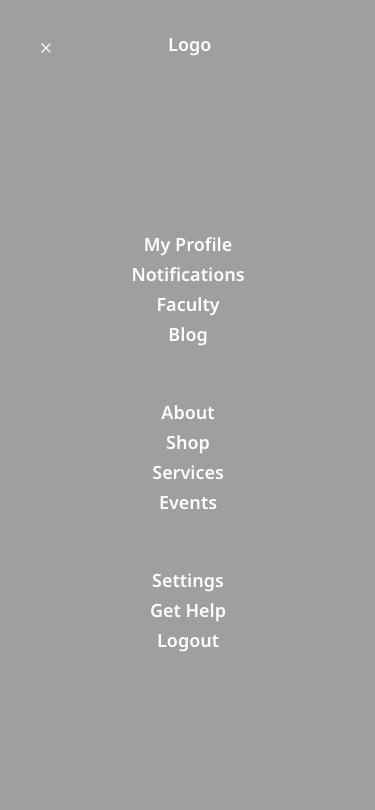
Onboarding
After testing the onboarding, it became apparent that I should focus on navigation. I wanted to make sure that students understood the dashboard and were able to see what was available in the app.
Having in mind the findings that different tools would be used in different stages of the learning process, I tried to show that students had control over their dashboard display - they could adjust according to their current needs.
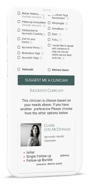
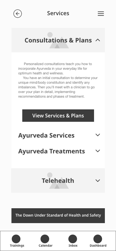
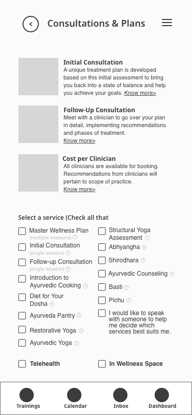
Practitioner Suggestion
There was another problem with the onboarding process for both classes and services.
Because Ayurveda treatments are very personalized according to one's constitution, new students and patients had to undergo an extensive intake form. They also had to talk to one of the practitioners to be able to find the best professional for their needs.
This tool gathered the information through a user-friendly form and calendar, and suggested the best practitioner within seconds, according to people's needs, availability, and preferences.
Research
There were 3 interviews (2 formal and 1 informal) with stakeholders and 1 survey was passed among current students. The company did not give me access to interview students, therefore I had to come up with a survey that also delved into more qualitative data.
This was a big blind spot in the project, and it would be necessary to go back and interview current, past, and prospective students to validate the data and iterate in order to deliver true value to the user. Most of the project was developed remotely, but I made sure to visit and shadow one of the staff through a day in the company and interview a coworker in person.
05 - INTERVIEWS
The interviewed stakeholders were the Ayurveda School director, administrative manager, and one member of the desk staff. That gave me a clear insight into the disparities between what each member perceived as the most pressing issues during COVID-19 readjustments. Here are some discernments I came across:
- TIME MANAGEMENT: While most of the staff was worried about time management with the current workload, the director wanted to expand the course load
- BUSINESS PLAN: They didn't have a business plan and their decisions were mostly made through "feeling like it was the right thing to do"
- COMMUNICATION: Communication was an issue, and they mainly used e-mail and phone (as for now they started using Slack)
- SYLLABUS: The courses offered were currently lacking syllabus, course structure, calendar, etc.
- COURSE DROPOUT: There was a high rate of non-completion - 15% of the Ayurvedic Health Counselor course
06 - SURVEYS
The surveys were distributed amongst the current student body - over 100 students. The responses came from only 14 of them, most enrolled in the Ayurvedic Health Counselor course. Here are some insights and quotes:
"I would like to have a clearer syllabus for the entire AHC program, class by date, etc."
"Occasional office hours for Q&A with faculty, a clear syllabus/schedule for the year..."
"It might be nice to get optional writing prompts. That way if students feel like sharing them, we could get to know each other better through writing."
- INSTRUCTORS: 100% of the students reported that the reason they chose BAS was the quality of their instructors
- ORGANIZATION: 33.3% of the students complained about not having a clear syllabus, about the lack of organization, and how hard it was to reach the faculty
- AGE: 44.4% ranged between 31–41 years old
- GENDER: 100% identified as women
- CONVENIENCE: Streamline access to ensure continuous and engaged usage of the platform and courses, and make relevant information accessible to users at all times
- AESTHETICS: Make sure the aesthetics match the brand identity and create an accessible application for students
- COMMUNICATION: Allow effective communication amongst students, staff, instructors and practitioners in a single platform
- EASE: Make it accessible for non-tech savvy users with ages ranging from 25 to 65 y.o.
07 - GOALS
- PRIMARY PERSONA: Ayurvedic Ana
Her goals are to learn more about her body, apply Ayurveda to herself and her family, and enjoy the status that comes from learning from the best
Her frustrations are the unclear syllabus and calendar, having a hard time contacting her faculty, and not being able to take notes and share them with her peers
"Being able to hear from everyone in the group about their
learning and development really made the material come alive"
- Student about the discontinued course
08 - USER PERSONAS
While building the journey of the students of enrolling into classes with the Ayurveda school, I realized some pain-points with great opportunities:
- There were a lot of different platforms being used alternately (email, TalentLMS (student portal), BAS Website and phone) which seemed to confuse the users
- The long and unavoidable legal text prior to purchasing a training could be demotivating prospective students to purchase it (needs validation)
- The onboarding process was long and had too many unnecessary steps, the users were giving up before even committing to the course
- They needed to focus on the foundational issues that affected directly both students and staff before any expansions (especially during COVID-19)
09 - JOURNEY MAP
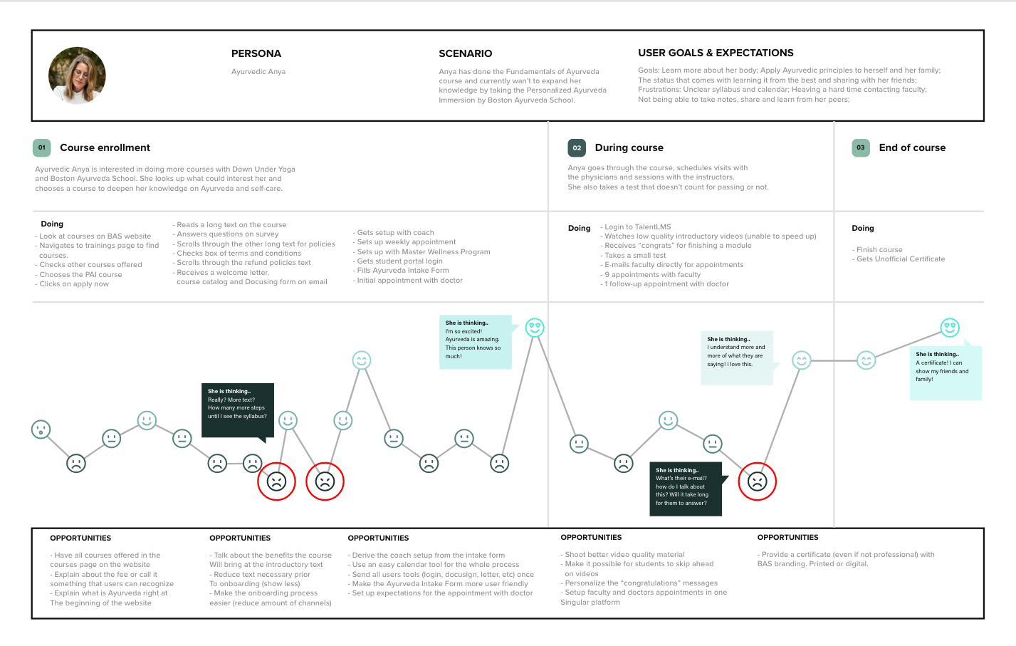
Experience
In order to deliver a solution that would take into consideration all insights from the previous tools (visit my Medium page for all the tools used), I had to think of something that could encompass what users needed the most, in every step of the way. Building the experience is what I've been doing so far, but now I could see the process more holistically and design for the users, not myself.
10 - MINIMUM VIABLE PRODUCT
HOW MIGHT WE...
...improve the communication between students, faculty, doctors and staff so it becomes less confusing for everyone and reduces the workload and effort on both sides?
... make sure that students know what to expect and how to prepare for the course prior to enrollment to reduce dropouts and unnecessary complaints?
... simplify the onboarding process in a way that generates more value to new students without leaving important information aside?
MVP: Students will be able to see the whole learning process before and during their courses, while able to communicate with faculty, other students, and doctors.
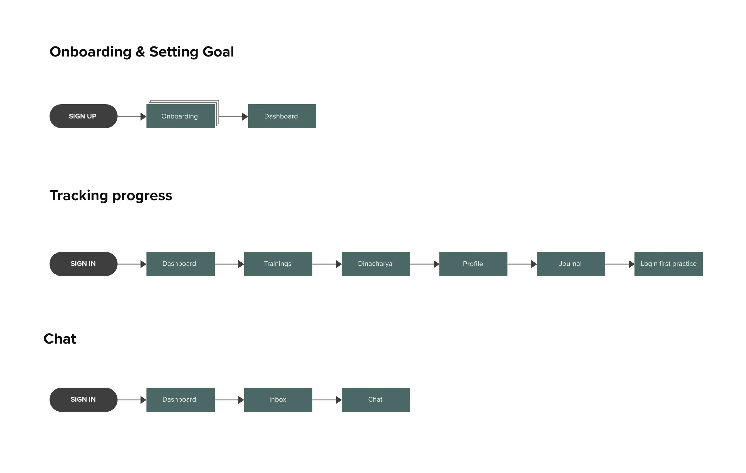
The user flows were based on the findings from previous tools and requisites from Ironhack's challenge. I created 3 different flow charts.
- ONBOARDING & SETTING GOAL: Ayurvedic Ana's first contact with the app. She signs up and accesses the onboarding tool. It shows her the Onboarding screen, Dashboard, Trainings, Calendar, Chat, and Dashboard being used in simple animations. After finishing it, she is redirected to her dashboard
- TRACKING PROGRESS: After her first login, Ayurvedic Ana has access to her trainings, already set on her profile with the school’s API. She went to her trainings, then opened the Dinacharya class - where she chooses her self-care routine - and tries it home. Then opens her Profile again, enters her Journal, and logs and submits her first practice.
- CHAT: Her instructor asked Ayurvedic Ana to submit a journal entry every day. She isn't sure if she has to submit only one, or she can do more than one entry-a-day. She opens clicks on Inbox in the bottom menu, selects her instructor in her conversations, and asks the question.
11 - USER FLOW
For the low-fidelity prototype, I focused on the screens that were part of the 3 user flows. So they were: Onboarding, Dashboard, Training, Calendar, Chat, Profile, Journal, and Inbox. I like to find a balance between a fast enough prototype that doesn't make me lose too much time, and something that is comprehensible and brings true insight to the process.
12 - LOW-FIDELITY PROTOTYPE
I created two versions of the wireframes (or mid-fidelity prototype) according to the user’s inputs and feedback.
- The onboarding incomplete text was confusing users — they didn't seem to know what to do next, or if the text would show up at some point.
I mitigated that by completing the text when needed.
- Some of the drop-downs within the “Trainings” page appeared to have a double function — dropdown and button.
I created a button for "All Trainings" and kept the dropdown only for the courses already available for the student.
- I added "check syllabus" for the Trainings screen on the second version of the mid-fi prototype-important part of the research that I simply forgot on the first version.
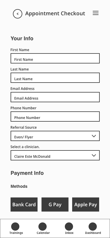
- Services & Plans screen had too much scrolling and was particularly confusing to my users. Users were unable to use checkboxes and read through the content.
I split it into Services & Plans and Appointment checkout
13 - WIREFRAMES


Interface
After the second version of the mid-fi prototype, I went onto Visual Competitive Analysis and brought elements of our biggest competitors’ websites (Kripalu Center for Yoga & Health, and Kerala Ayurveda). Read more in the complete case study.
At this point in the project, I would usually start a mood board, test it, and then design Style Tiles. Because there was already an Ayurveda School brand and a website, I jumped to style tiles and tested it, looking for discrepancies in relation to the brand's attributes. I got the words warming, gracious, and relaxing repeatedly.
The brand attributes were:
Smart, warm, inspirational, heartfelt, and Ayurvedic.
14 - STYLES
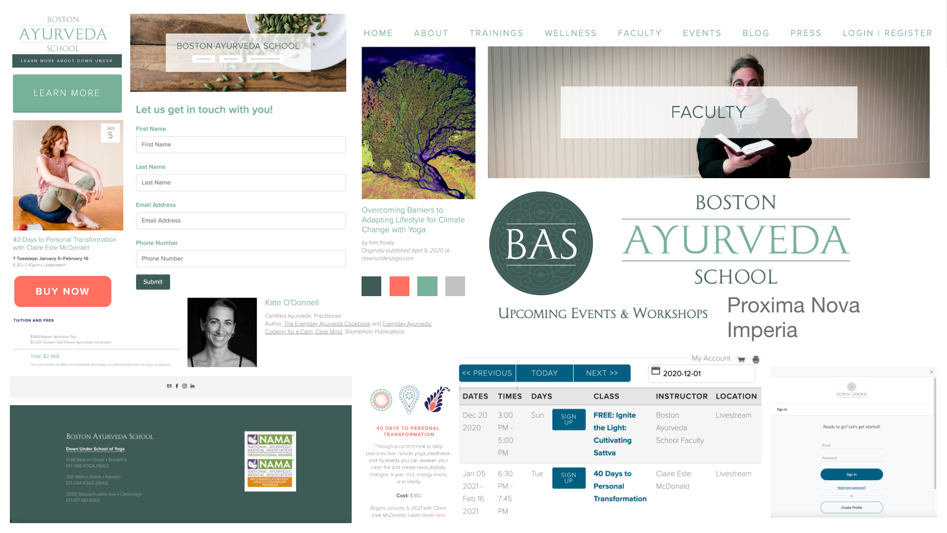
BAS Style Tiles / Mood-board
The high-fidelity prototype was developed based on the company's website. I used some of the button aesthetics and translated them to a mobile platform. I also designed a visual documentation of icons, buttons, menus, images, etc., using the Atomic Design System as reference.
15 - HIGH-FIDELITY PROTOTYPE
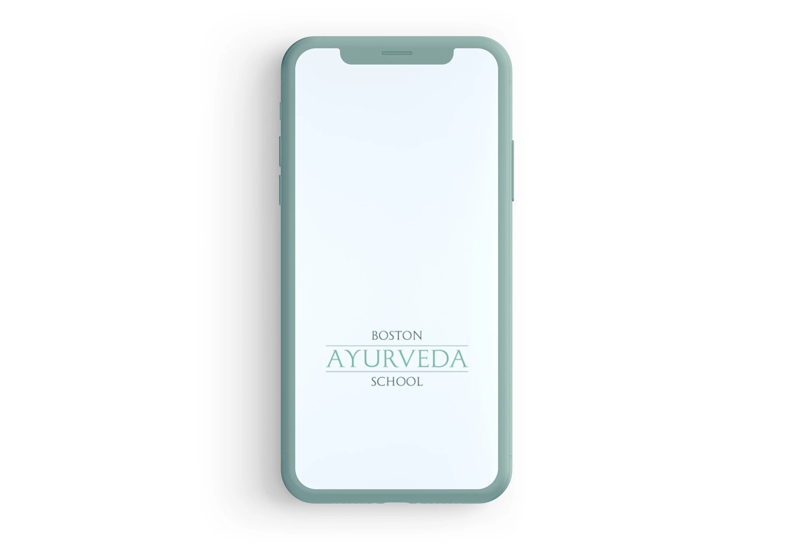
Click on the phone for the interactive prototype
Metrics & Next Steps
- INCREASED CONTENT ENGAGEMENT: Increased course completion rate- Increased enrolled courses per student
- INCREASED COURSE SATISFACTION: Increase in self-reported satisfaction- Decrease in course dropout rate- Increase in referrals
- OPTIMIZED COMMUNICATION: Increased adoption rate of in-app messaging feature- Reduced volume of out-of-app channels (email, slack, etc)
16 - SUCCESS & FAILURE METRICS
- Validate data with dropout, new and ongoing students
- Investigate experience with students from other schools
- Finish developing existing courses
- Streamline the onboarding process
17 - NEXT STEPS
Thank you for your time.