
Case Study 02
Turning CVS Health's Data Documentation Into a Product Its Users Could Actually Navigate
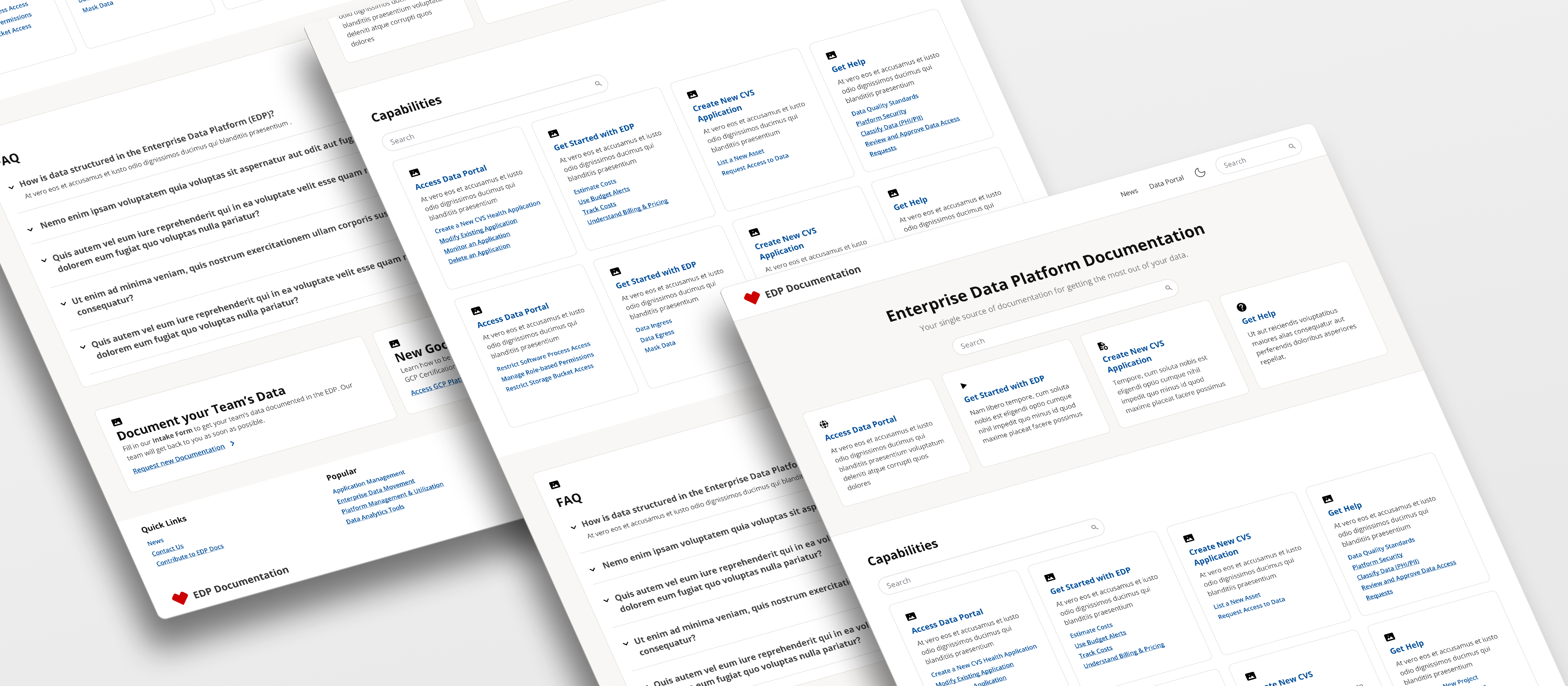
Jump to
Context
Twenty-two months, 500 pages, two problems that looked like one.
CVS Health's Enterprise Data Platform had a documentation site. It contained roughly 500 pages of technical guides, platform references, governance policies, and onboarding content — accumulated over years, with no governing information architecture and no clear content ownership. The team knew users struggled to find things. What took time to untangle was exactly why.
The surface problem was structure: documentation organized around what the platform was — its product names, team territories, internal vocabulary — rather than what users needed to do. The deeper problem was position: the Documentation Center lived as a single tile on the Data Portal homepage, instead of being the product that organized everything. Fixing the structure without fixing the container would have produced a well-organized page that users still couldn't find.
The Problem
Documentation Organized Around What the Platform Was, Not What Users Needed to Do
Navigation That Required Users to Already Know Where to Look
The Documentation Center's top-level navigation mapped the platform's internal geography — product names, team territories, system components. Labels like "Tenant & User Management" and "Data Platform Infrastructure" assumed users already understood the platform's taxonomy before they could find anything in it. In an unmoderated navigation test with 16 participants, all five who had never used the site before either dropped every task or failed to find the correct path. The failure wasn't about difficult content — it was about first-time orientation. There was no starting point for someone who didn't already know where things lived.
A Documentation Product That Wasn't Positioned as One
The Documentation Center existed as a single tile on the Data Portal homepage — one entry among many, not the organizing surface. Users didn't know whether they were already inside it, whether they needed to navigate into it, or whether it was a separate product entirely. In the test, one participant navigated away from the Documentation Center tile while searching for "documentation" — because the tile gave no indication of what was inside it. This wasn't a discoverability problem that better copy would fix. It was a positioning problem.
Research & Insights
What Two Rounds of Tree Testing and a Full Content Audit Made Clear
The research ran in two rounds: an exploratory navigation test in 2024 to document what was breaking, and an evaluative test in 2025 to validate the proposed fix. Between them: a 497-page content inventory, a team-wide card sort, and a TW-led content audit. Four findings shaped the scope of the redesign:
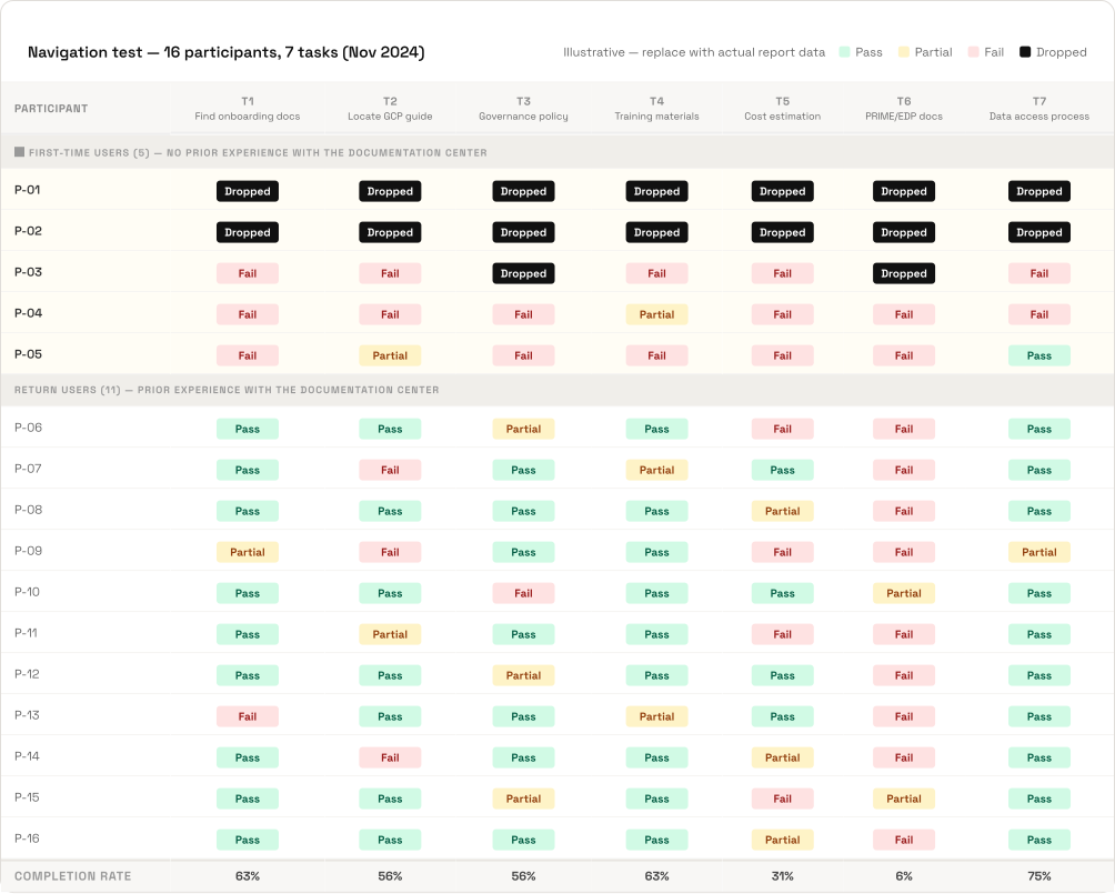
Cold-entry users failed the navigation immediately — and never recovered
All five participants who had never used the Documentation Center dropped tasks or failed to navigate correctly. Two abandoned every task without completing one. The finding mattered because these weren't outliers — they represented the experience of every new user hitting the site for the first time. The User Success Lead, who had authored most of the EDP articles, arrived at the same diagnosis independently during the team card sort:
"I really struggled with where to put the EDP articles. As the one who wrote all those articles I'm afraid to say that I think we've made that tile almost obsolete or at the very least way more slimmed down than it is currently."
The Documentation Center name caused active confusion, not orientation
Participants consistently failed to understand the Documentation Center as a navigational construct. They didn't know if they were inside it, if they needed to go into it, or if it was a different product. The name described what the team had built, not what users needed to find. A design annotation placed directly on the V1 sitemap canvas during this period captured the team's own conclusion: "Data Documentation Center (this level doesn't exist for users)."
Two brand names for one platform created a structural trap
PRIME and EDP appeared as parallel top-level sections — two names for what users understood as one platform. Participants who failed in one would second-guess whether the answer was in the other. During the internal card sort, one team member named the deeper issue: this wasn't a navigation problem to fix within the portal — it was a product positioning problem. The Documentation Center needed to be the container, not a tile inside one.
"EDP = one product / Docs Center is/should be for multiple products (including docs center)."
63% of 496 pages were owned by three people
The June 2025 content audit confirmed what the 2024 inventory had suggested: the documentation had a governance problem, not just a navigation one. One writer had authored 186 pages — 37.5% of the total site. If those three people left, two-thirds of the documentation would be effectively orphaned. A better navigation structure built on top of an unowned content base wouldn't hold.
Process
Two Phases of Research Before a Line of Visual Design
The sequencing was deliberate: IA problems at this scale need evidence before proposals, and content quality problems require the people who own the content to be part of the solution — not just the audience for it.
Phase 1 — Discovery: Inventory, Testing, IA Redesign (Aug–Dec 2024)
Phase 1 began with a content inventory — 497 pages catalogued across the Documentation Center and a parallel Confluence space. A 16-participant tree test followed (7 tasks, unmoderated and moderated sessions via UserTesting.com). Before the research report was delivered, I ran an internal card sort with seven team members using the same stimulus as the tree test. The goal wasn't additional research — it was alignment. If the findings were going to be uncomfortable, the team needed to have already arrived at the same conclusions independently. They did: despite using different organizing principles, every participant independently produced a task-based structure.
The December 2024 research report synthesized findings into 7 recommendations. The same day it was finalized, seven Figma versions were saved in a single editing session — the most intensive in the file's history. That intensity reflected what the research had already made clear, not a new round of open deliberation. The output was IA V2: a complete reframe that replaced system-based top-level labels (Enterprise Data Platform, Training, Tools & Capabilities) with task-based ones (Get Started, Data Learning Hub, Find Data Assets, Access Data Assets).
Phase 2 — Content Audit and Validation (Jun–Oct 2025)
The standard approach would have been for UX to audit 496 pages and present findings to the Technical Writing team. The problem with that: delivered findings are easy to receive and easier to deprioritize. Instead, I ran a UX content audit methodology workshop before any pages were rated — teaching TWs to apply the same criteria I would have used (plain language, heading clarity, content goal alignment, user group match). The audit conclusions became something they co-authored rather than received. By June 11, 200+ pages had per-page verdicts — modify, remove, or keep.
A second research round ran September through October 2025: a pre-workshop survey, a closed card sorting study (45 cards, 9 predefined buckets, 4 archetypes), and a 14-participant tree test against the proposed IA. Unlike the 2024 test, which documented failures in the existing structure, this one evaluated whether the proposed structure performed better.
Visual Design and Platform Migration (Nov 2025–Jun 2026)
Visual design began November 6 in a 1:1 with a core Technical Writer — not a solo exploration. Starting with the person closest to the content was intentional: the IA decisions needed stress-testing against what the writing team actually knew before any visual direction was committed to. Within two weeks, the broader TW team had joined across at least three working sessions. By V6 (December 11), labeled "After exploring with AI prototyping," AI-generated directions were being used as inputs between human sessions, not as outputs.
The formal redesign proposal was compiled in January 2026 — two months after design work had begun. The sequencing was atypical, and worth naming: design exploration preceded organizational backing rather than following it. It worked here because 18 months of research provided enough foundation to work from with confidence. The Hugo-to-Docusaurus platform migration, confirmed by March 2026 when a prototype went live at edpdocs.dev.cvshealth.com, materialized the architectural decision — documentation as a standalone product at its own domain, not a feature of the portal.
Solution
A Task-Based IA, a Standalone Product, and a Way In for Every User
The redesign addressed both layers of the problem — structure and position — with three decisions that built on each other. Solving the navigation without relocating the product would have produced a well-organized page that users still couldn't find.
Task-Based Navigation Replacing Platform Geography
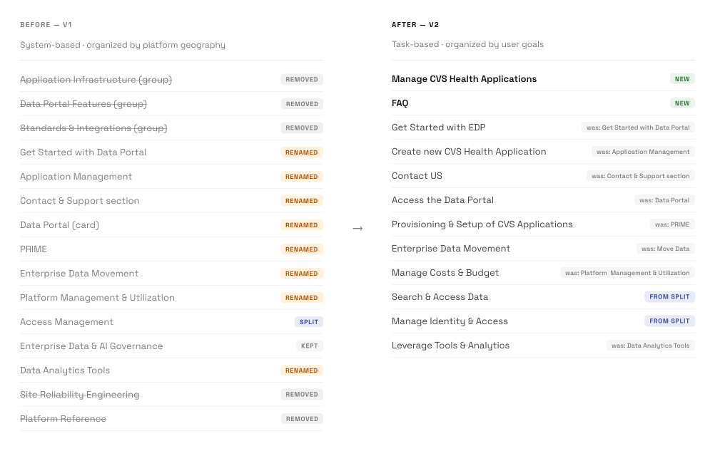
Before
Top-level sections named for platform components and team territories: Enterprise Data Platform, Training, Tools & Capabilities, Creating Platform Documentation, About the EDP. Navigation required users to understand the platform's internal taxonomy before they could orient themselves.
After
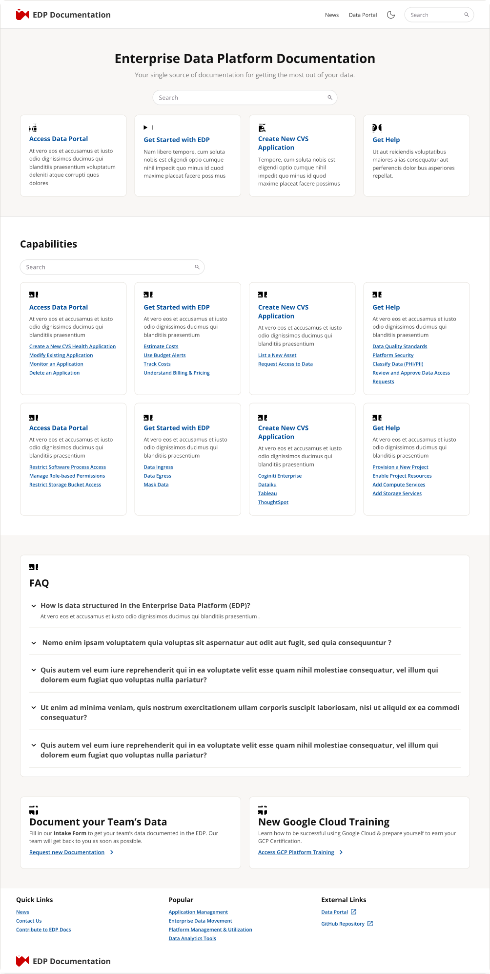
Top-level sections named for user goals and tasks: Get Started, Data Learning Hub, Find Data Assets, Access Data Assets, Manage Data Assets, Data Governance, Get Help. The PRIME/EDP parallel structure was collapsed. "Get Started" promoted to root level. "Documentation Center" removed as a named tier — its content redistributed under task-based sections. FAQ sections added at every level.
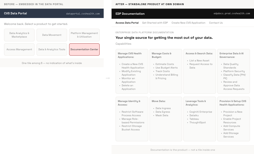
Standalone Product Replacing a Portal Tile
Before
Documentation Center as one tile among many on the Data Portal homepage. Architecturally positioned as a sub-product — something users had to navigate into, not the surface that organized everything. Hugo-based, embedded in the portal's URL structure, with no distinct product identity.
After
edpdocs.prod.cvshealth.com — a dedicated Docusaurus-based product at its own domain. The domain change materialized the design insight: documentation is not a feature of the Data Portal. It is the product that organizes everything. Users who navigate external developer documentation products already know how to interact with this pattern.
Role-Based Entry and a Content Type System
Before
One navigation structure for all users — requiring engineers, business analysts, data scientists, and managers to interpret the same technical vocabulary before finding what they needed. Pages mixed task-based instructions with conceptual overviews, creating audience confusion at the content level as well as the navigation level.
After
Homepage capability filter chips (Data Engineering, Data Querying, Data Owners, Data Consumers, Data Reporting, DDAT, Business) let users declare their context rather than interpret the platform's. Users who don't know what "PRIME" means can pick "Business" and route from there. A Task vs. Concept page template system separated instructional from conceptual content at the authoring level — the distinction enforced before pages are written, not retrofitted after.
Impact
A Documentation Product, Not a Documentation Section
The redesigned Documentation Center launched at edpdocs.prod.cvshealth.com in June 2026. Because the site operates behind CVS Health's network boundary, post-launch user behavior data wasn't available at the time this was written. What's confirmed is the shipped state — a standalone product at its own domain, with a task-based IA, role-based navigation, Pulse Analytics design system components, and a content type template system that didn't exist before.
496
Pages evaluated with per-page UX verdicts — replacing undifferentiated accumulation with a defensible content baseline
7
User groups with role-based homepage entry — replacing a single undifferentiated navigation path
1 product
Documentation relocated from embedded portal tile to standalone platform at its own domain
Some features — including at least one capability filter state — shipped as "Coming soon," with a roadmap for completion in the next phase. The task-based IA, role-based filter chips, and Task vs. Concept page templates all shipped on initial launch.
Reflection
What This Project Taught Me About Working at the Architecture Level
The Proposal Came After the Design Had Already Started
The formal redesign proposal was finalized in January 2026. Design work had begun in November 2025. The typical sequence inverted: design exploration preceded organizational backing rather than following it.
What I decided- I framed the early design iterations as exploration, not commitment — documented in Figma as experimental directions rather than handoff-ready deliverables. Concrete mockups made the January proposal more actionable than recommendations alone could have been.
- This worked because 18 months of research gave enough foundation to design from confidently. It isn't a general principle: in a project with less documented evidence, designing before securing alignment risks generating work that has to be discarded.
Training the People Who Owned the Content to Audit It
The standard approach: UX audits 496 pages, presents findings to the Technical Writing team. The problem with that approach — delivered findings are easy to receive and easier to deprioritize. They don't change how people think about the content they maintain.
What I decided- I ran a UX methodology workshop before any pages were rated — teaching the TWs to apply the same criteria I would have used. Audit conclusions they co-authored were harder to set aside than findings delivered to them.
- The cost was time upfront. The payoff was that per-page modify/remove/keep decisions were owned by the people who would have to act on them — which changed the relationship to the findings.
Key learnings
Architecture Is Product Strategy
Where you put the documentation determines who can find it. Moving from a portal tile to edpdocs.prod.cvshealth.com wasn't a technical migration — it was a positioning decision. Better navigation labels don't help if users can't locate the product they're navigating.
Uncomfortable Findings Need Internal Champions Before They Go to Leadership
The tree test found that all cold-entry users failed. The content audit surfaced that two-thirds of the site had a single-point-of-failure ownership problem. Both findings implicated decisions made before this project began. Running the internal card sort first — where the team arrived at the same conclusions independently — meant the formal research report wasn't announcing problems. It was confirming what the team had already acknowledged.
What's your next big challenge?
I'd love to help tackle it. Reach out by email or connect with me on LinkedIn.